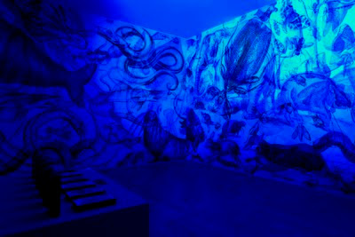
I came across an Italian studio called Carnovsky made up of Francesco Rugi and Silvia Quintanilla.
At first I just loved the colours and imagery. The more I read about the work the more I realised how interesting it was. This insulation and work is called RGB and it is very clever.
RGB designs create surfaces that mutate and interact with each other.
Basically the technique is three sets of imagery in primary colours all overlapping and intertwining with each other... resulting in what looks like a colourful mess!
I think I might take the basis of this idea of using three primary colours to create more colours and use it for a silk scarf print!


0 comments:
Post a Comment